Why Do Certain Vintage Bottle Caps Look Different?

This post explores the physical variations in vintage metal crown caps, focusing on why color, embossing, and rim shapes change between different eras and manufacturers. You'll learn to identify common structural differences and understand how production methods shaped the caps we find in antique shops today.
What makes vintage bottle cap designs change?
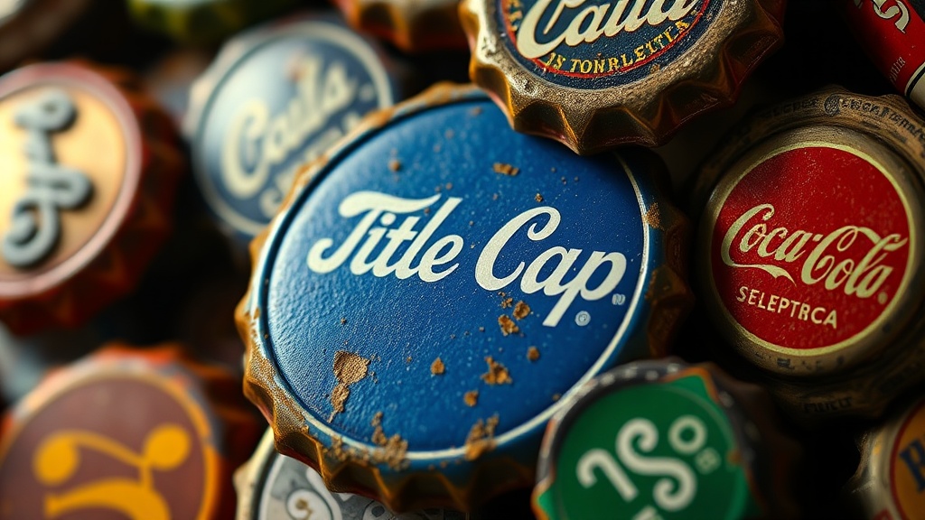
When you look closely at a collection of old soda or beer caps, you'll notice right away that they aren't all uniform. The variations stem from a few specific factors: the metal used, the printing technology of the time, and the specific function of the cap. In the early 20th century, metal stamping wasn't as precise as it is now. This meant that the way the teeth (or crimps) gripped the bottle neck could vary wildly from one manufacturer to another.
One of the biggest shifts occurred when printers moved from hand-stamping designs to more advanced lithography. This transition changed how much detail could actually fit on a small surface. If you see a cap with very blurry or faint lettering, it's often a sign of an older, less refined printing process. These small details—the thickness of a line, the way a logo is centered, or even the color of the ink—tell a story about when and where that specific cap was made. It's not just about the brand; it's about the industrial capabilities of the era.
How can I identify a rare metal crown cap?
Identifying a rare cap requires a keen eye for the "small stuff." Collectors often look for specific traits that set a piece apart from standard, mass-produced items. Here are a few things to watch for when you're out hunting:
- The Rim Shape: Look at the underside of the cap. Some vintage versions have much more aggressive or uneven crimping compared to modern, perfectly circular versions.
- Embossing Depth: High-quality vintage caps often have deeper, more tactile embossing. If the logo feels almost three-dimensional, it might be a more sought-after piece.
- Ink Saturation: Older printing methods used different types of pigments. A cap with a deep, slightly uneven ink saturation is a hallmark of a certain age.
- Metal Patina: While we want things to look clean, the way a metal cap has oxidized can tell you a lot about its age and storage environment.
A great resource for understanding historical manufacturing standards is the Library of Congress, which holds many archives regarding American industrial history. Understanding the broader historical context helps you realize that a "flaw" in a cap's design is often just a characteristic of its time.
Is the color of the cap a sign of age?
Color is one of the most deceptive aspects of collecting small metal items. While it's tempting to think a bright, vibrant color means it's newer, that isn't always the case. Historically, the pigments used in ink were much more volatile. Some older caps used lead-based pigments or specific dyes that reacted differently to light and air over decades. This can result in a "faded" look that collectors actually find desirable because it proves the item has aged naturally.
However, you also have to watch out for modern reproductions. A "vintage-looking" cap that looks too perfect or has a suspiciously consistent color across a whole batch might be a modern piece designed to look old. Real vintage metal often shows slight variations in hue across the surface due to the way the metal was treated. If you're looking at a batch of caps, look for those tiny imperfections—the slight discoloration or the way the color bleeds slightly outside the lines of the logo. These aren't mistakes; they're evidence of the production techniques used during that specific period.
For more technical details on how metal products were historically standardized, you can research the National Institute of Standards and Technology archives. They provide insights into how measurements and manufacturing tolerances evolved, which is exactly why no two vintage caps look identical under a magnifying glass.
A Note on Metal Oxidation
It's easy to get caught up in the aesthetics, but remember that metal is a living material in a sense. It reacts to its environment. A cap that has been stored in a damp basement will look significantly different from one kept in a dry, climate-controlled display case. When you're evaluating a new find, always consider the environment it came from. A bit of surface rust or a dulling of the shine isn't always a bad thing—sometimes, it's the very thing that proves the item's authenticity.
The Importance of the Underside
Never judge a cap solely by its top side. The underside is where the real secrets are hidden. The way the metal is crimped around the edge can reveal a lot about the machine that made it. A hand-crimped edge looks much different than a machine-stamped edge. If you're serious about collecting, you'll spend a lot of time looking at the bottom of these items. That's where the structural history is written.