6 Iconic Soda Brands That Changed Bottle Design Forever

The Coca-Cola Contour Bottle Evolution
Pepsi-Cola's Classic Script Era
Dr Pepper's Unique-Shape Legacy
The Rise of the Schweppes Highball Style
RC Cola's Distinctive Branding
7-Up's Iconic Green Glass Transition
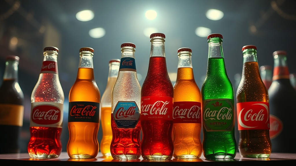
A heavy glass Coca-Cola contour bottle sits under a warm spotlight, its curves catching the light in a way that makes the embossed lettering pop. It isn't just a container; it's a piece of industrial art. Throughout the last century, the way we hold a drink has shifted from utilitarian glass jugs to highly specialized, branded vessels. This post examines six soda brands that fundamentally altered the shape, texture, and identity of the bottle through design innovation.
Design isn't just about aesthetics. It's about branding, ergonomics, and—for collectors—identifying the nuances that separate a common piece from a museum-quality specimen. We'll look at how these shifts impacted the market and what collectors should look for today.
Why did the Coca-Cola contour bottle become so iconic?
The Coca-Cola contour bottle was designed to be recognizable even if you felt it in the dark or if it was broken on the ground. Developed in 1915, the shape was a response to a request for a bottle that was "distinctively Coca-Cola."
Before this, most soda bottles were generic, cylindrical, or slightly tapered. The introduction of the "hobbleskirt" design changed the game for the beverage industry. It moved the focus from the label to the glass itself. For collectors, this means the distinction between early straight-sided versions and the later contoured versions is a major factor in a bottle's history. If you're new to the hobby, you might want to check out my rapid bottle assessment guide to ensure you're reading the glass correctly.
The contour bottle did more than just look good. It created a tactile experience. The way the glass curves into the palm of the hand makes the product feel premium. It's a classic example of how physical form can dictate brand loyalty.
The evolution of the Coca-Cola bottle shape
- Pre-1915: Standard cylindrical glass bottles with minimal embossing.
- 1915: The birth of the iconic contour shape.
- Mid-Century: Introduction of more streamlined, lighter glass for mass production.
- Modern Era: Transition to PET plastics and aluminum, though the glass silhouette remains the gold standard for collectors.
How did Pepsi change their bottle branding?
Pepsi changed their bottle design by focusing on a wider, more approachable silhouette that emphasized their "choice of a new generation" marketing. While Coca-Cola leaned into elegance and curves, Pepsi often experimented with a more robust, utilitarian look that felt modern and accessible.
Collectors often look for the specific embossed lettering that distinguishes vintage Pepsi glass from modern iterations. The weight of the glass and the depth of the branding are key. A thin, lightweight bottle often signals a later, mass-produced era, whereas a heavy, thick-walled bottle usually indicates an older, more desirable piece. This is a great time to practice identifying authentic vintage glass coloration and texture, as the glass quality can vary wildly between decades.
The catch? Finding a truly pristine, unchipped vintage Pepsi bottle is harder than it looks. The glass used in the mid-20th century was often more prone to internal stresses, leading to the tiny cracks or "checks" you see in many thrift store finds.
What makes the Dr Pepper bottle design unique?
Dr Pepper's design history is defined by its ability to maintain a consistent brand identity while adapting to different container formats. Unlike brands that rely on a single, revolutionary shape, Dr Pepper has mastered the art of the "look and feel" across various glass weights and colors.
For the collector, the interest lies in the specific color of the glass and the clarity of the embossed logo. Dr Pepper has utilized a variety of amber and dark-tinted glass over the years. When you're inspecting these, pay close attention to the "shoulder" of the bottle. The transition from the neck to the body is where many counterfeits or later-era reproductions fail to match the original's complexity.
It's a subtle distinction, but it matters. A well-formed shoulder indicates a high-quality mold, which is a hallmark of early-to-mid-century production. If the glass looks "mushy" or lacks sharp edges, it's likely a modern reproduction or a lower-quality production run.
How did 7-Up design a signature look?
7-Up used a bright, clean aesthetic that eventually translated into a very specific bottle silhouette and a heavy emphasis on the "clear" look of the beverage. Because 7-Up is a lemon-lime soda, the transparency of the liquid (or the glass itself) became a part of the branding.
The design is often much more minimalist than its competitors. You won't see the heavy, aggressive embossing found on some older soda bottles. Instead, the brand relied on a sleek, streamlined appearance. This makes the collection of 7-Up glass particularly interesting for those who enjoy seeing how light interacts with the vessel. It's a much more delicate aesthetic than the heavy-duty glass of the early 1900s.
One thing to watch out for is the clarity. If you're looking at vintage 7-Up glass, any cloudiness (often called "sick glass") can significantly drop the value. This is why I recommend avoiding micro-scratches during bottle handling—preserving that pristine, clear look is the only way to keep the value high.
| Brand | Primary Design Trait | Collector Focus |
|---|---|---|
| Coca-Cola | Contour/Curves | Embossing depth and glass weight |
| Pepsi | Robust/Modern | Era-specific silhouettes |
| Dr Pepper | Amber/Dark Tints | Shoulder shape and color consistency |
| 7-Up | Minimalist/Clear | Glass clarity and transparency |
Why is the RC Cola bottle design significant?
RC Cola (Royal Crown Cola) represents the "alternative" choice that actually held significant market power. Their bottle designs were often more utilitarian, focusing on the strength of the glass and the ease of transport. This gave them a rugged, "working man's" aesthetic that stands in stark contrast to the elegance of Coca-Cola.
For collectors, RC Cola bottles are often found in much more "used" condition. Because they were marketed as a reliable, everyday soda, the glass was often thicker and less refined. However, certain rare variations in the neck finish or the cap style can make a specific RC bottle quite valuable. You can find more about these subtle differences in my deep dive into antique soda bottle finishes.
The simplicity of the design is its strength. There aren't many flashy flourishes to look for, so you have to rely on the quality of the glass and the precision of the mold to determine the age and authenticity of the piece.
How does the Coca-Cola bottle impact modern manufacturing?
The legacy of the Coca-Cola contour bottle extends far beyond the soda industry; it set a precedent for how every major beverage brand approaches packaging design. It proved that a container could be a brand's most recognizable asset, a concept that is now standard across almost every consumer goods category.
When you look at a modern beverage, you're seeing the evolution of these ideas. The way a bottle feels in your hand, the way the light hits the label, and even the sound of the cap cracking—these are all things that were pioneered by the design-heavy era of the 20th century. For those of us in the collecting community, these aren't just bottles. They are the physical manifestations of a brand's soul. Whether it's the heavy, textured glass of an old Coca-Cola or the clean, transparent lines of a vintage 7-Up, these designs tell a story of how we've interacted with flavor over the last hundred years.
Keep an eye on the details. The thickness of the base, the sharpness of the embossing, and the way the glass reflects light—these are the things that separate a simple soda bottle from a true collector's piece. The history of the soda bottle is written in the glass itself.